How can we improve the experience of discovering art in museums and galleries?
Overview
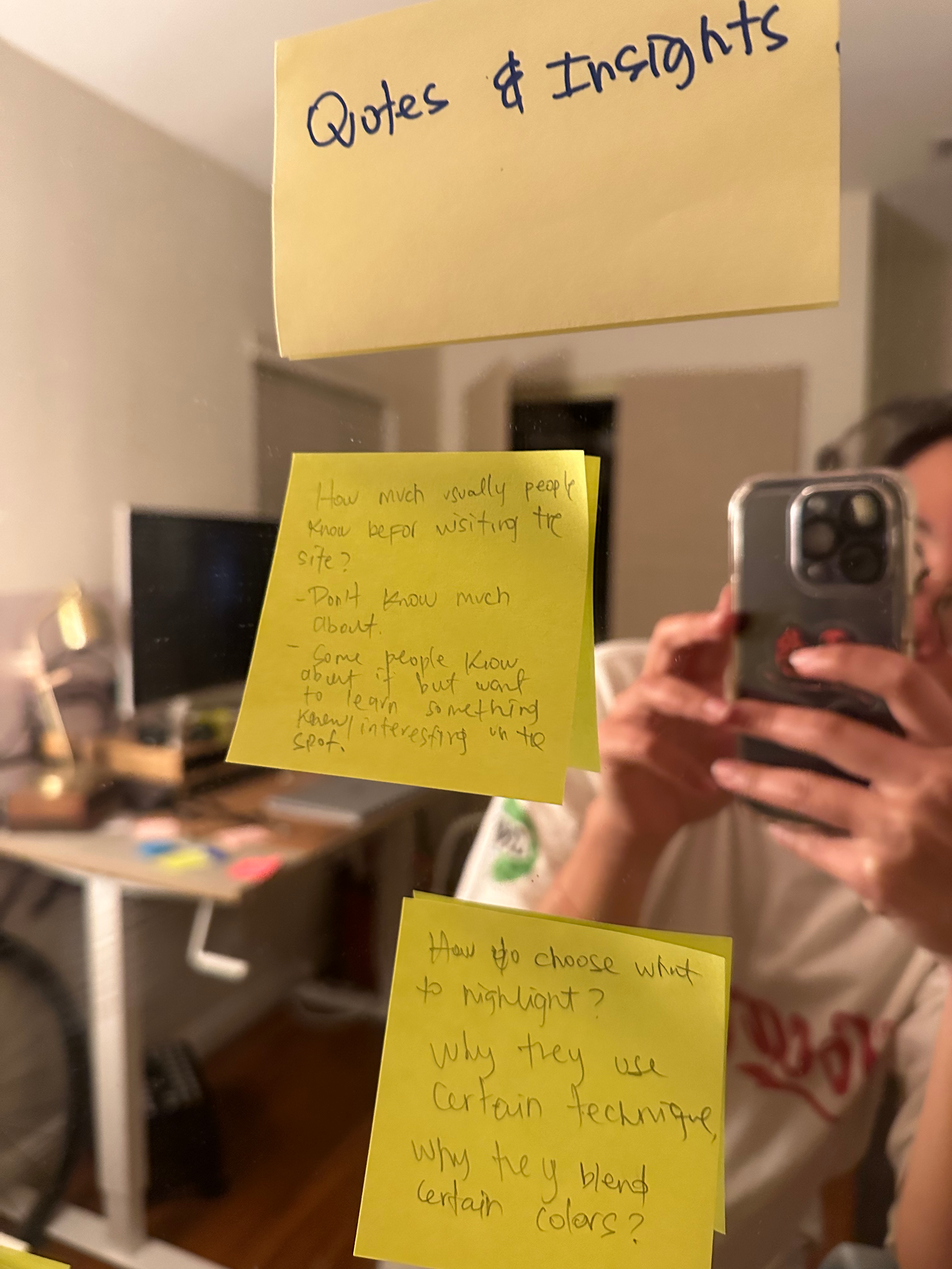
As they view artwork in the gallery, the engagement level of gallery visitors does not allow the viewer to get the best experience out of their visit. Visitors arrive at galleries with various levels of information about the artist, art style, and period.
Art is meant to be experienced from a subjective point of view, but what if you could get a curated guide that allows the viewer to get the most out of his visit?
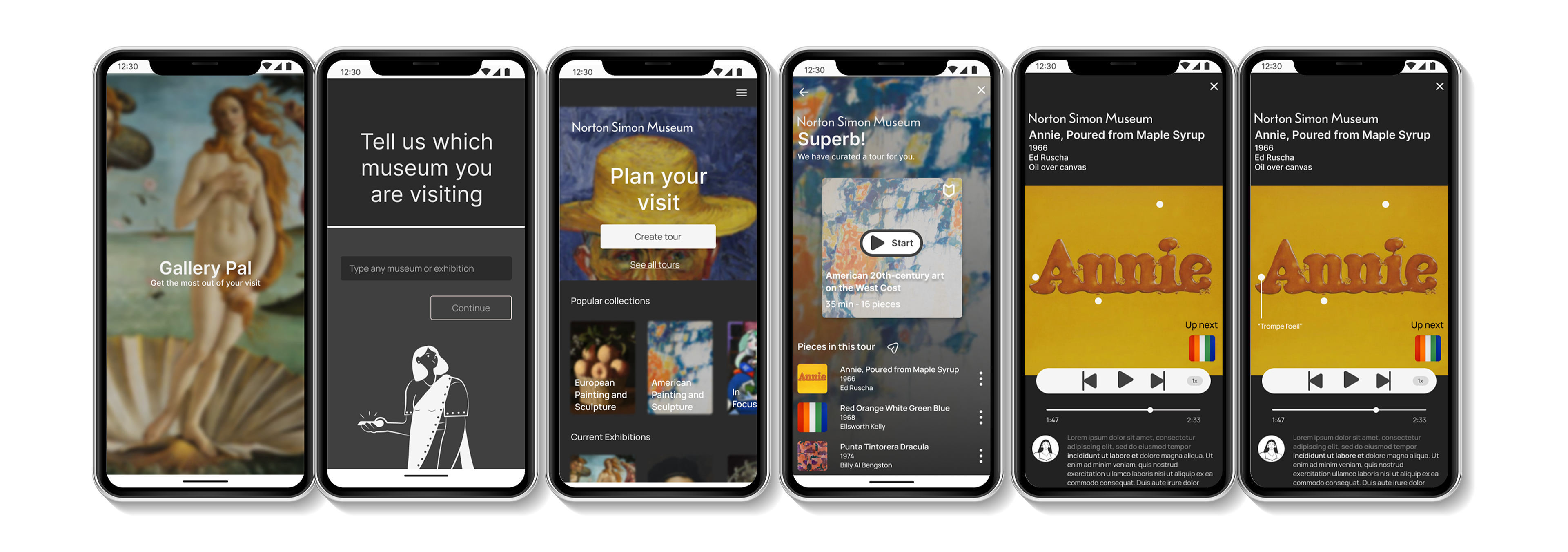
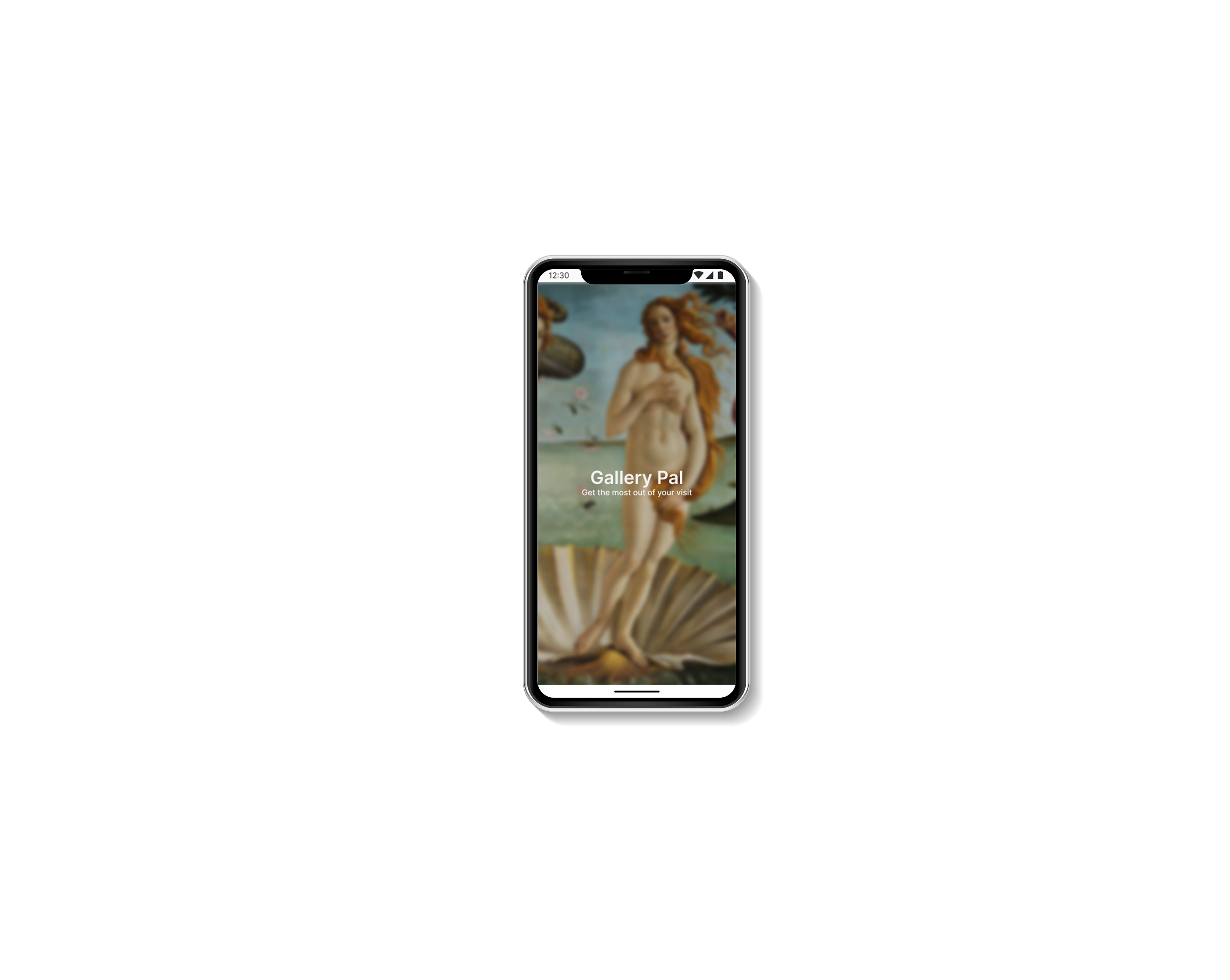
GalleryPal is an app that allows the viewer to get a curated art tour according to the personal interest of the visitor. Users can explore predetermined art tours or create their own with the guide of Gallery Pal.
This app also allows them to choose the information they would like to know about the artist, history period, and in some cases, get a personal message from the artist.
Design Sprint consisting of 5 days.
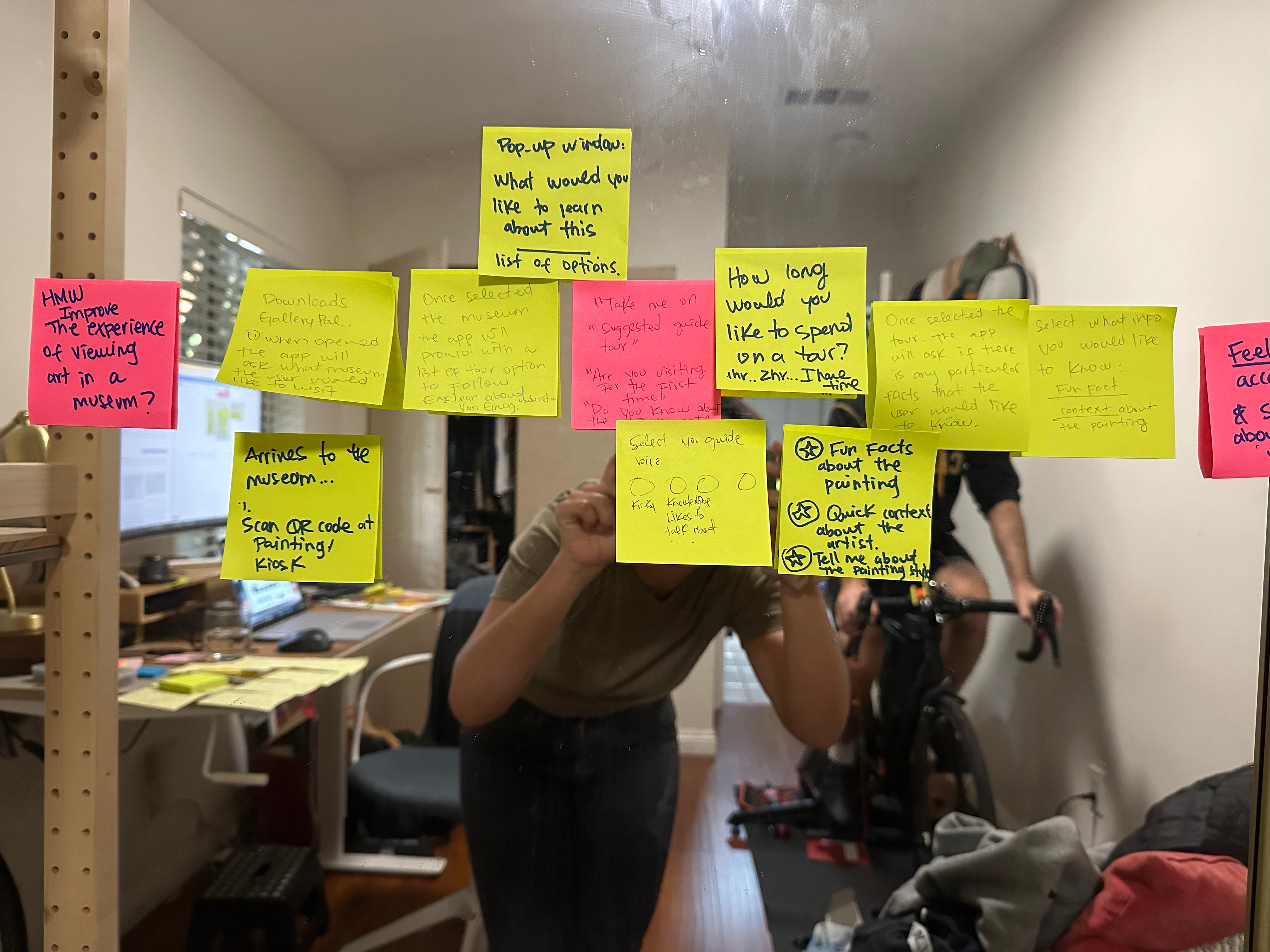
Day one consisted of mapping possible solutions to the problem identified. After organizing my information into three piles, I create HMW questions.
I will be focusing on this one:
I will be focusing on this one:
How might we Improve the experience of viewing and learning about art in museums?
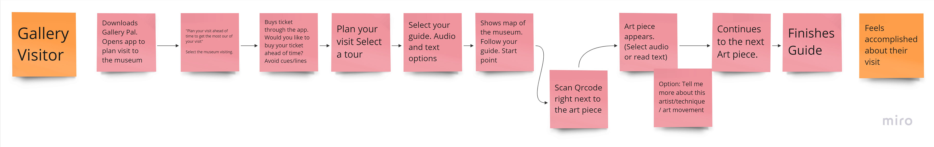
I began my Journey Map, demonstrating the process.
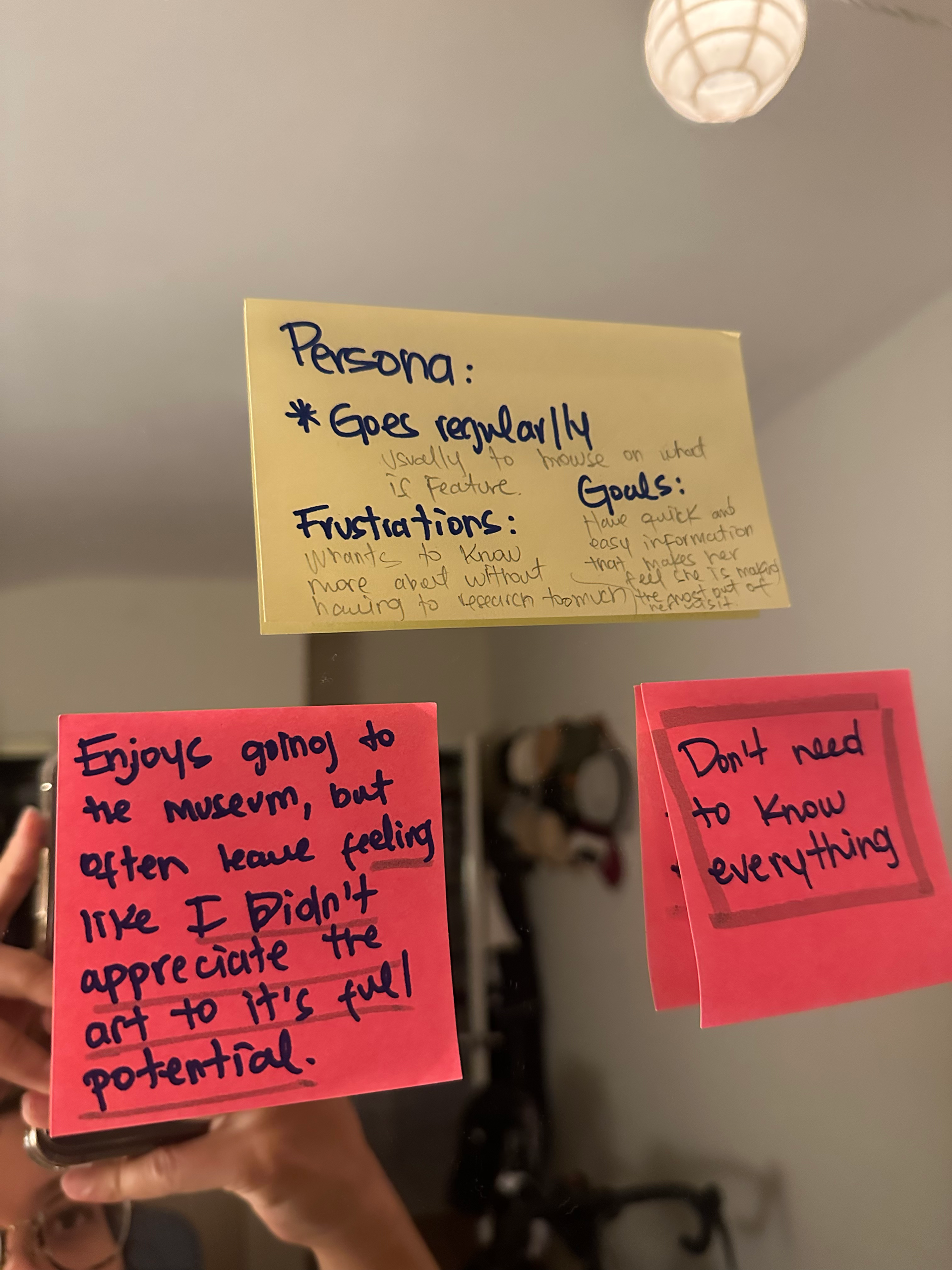
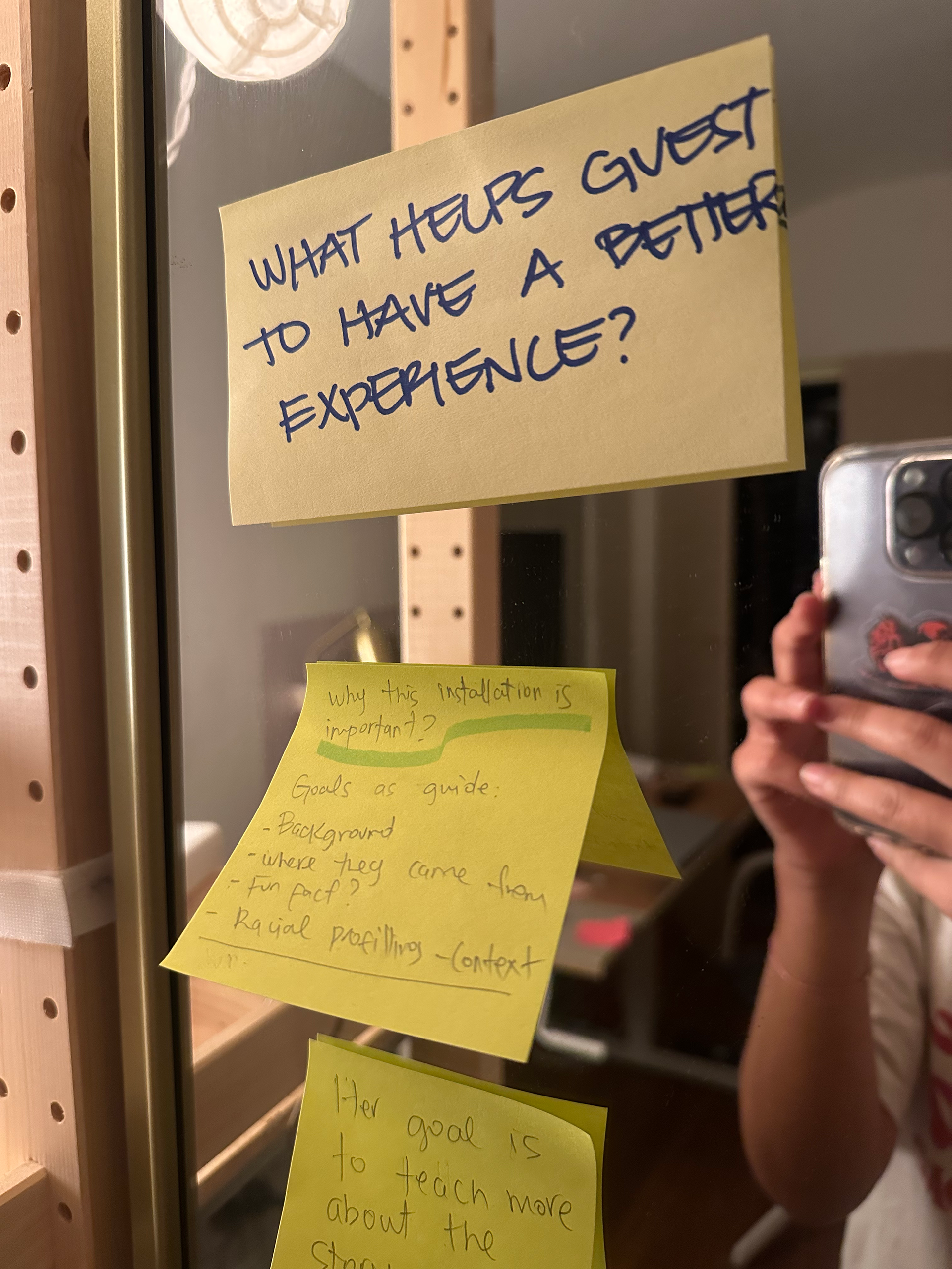
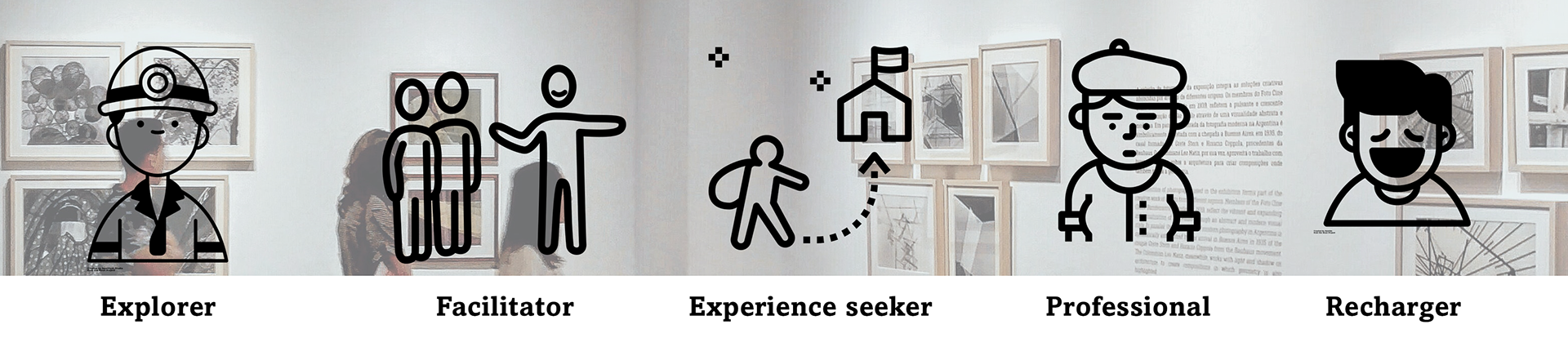
They are five types of visitors when vising a museum:
Day 2 - Lightning Demo
This consisted of looking into other solutions from current competitors in the market and sketching of solutions.
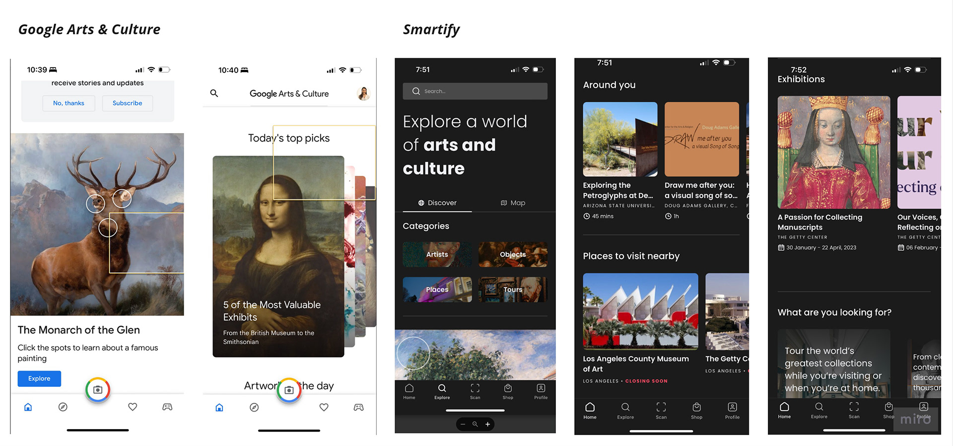
Google Arts and Culture
This app allows users to explore artwork by different topics, styles, and popular choices.
I enjoyed how didactic this app is. It even allows you to navigate where the painting is located or the area from which it was inspired. This app has many different functionalities, which could be overwhelming initially.
Smartify
The primary purpose of this app is to guide the user through a narrative behind the art piece.
They include features for scanning art pieces, viewing collections, and virtual tours. You can buy a copy of the artwork and try it out in different places gives a quick overview of the artist and the piece.
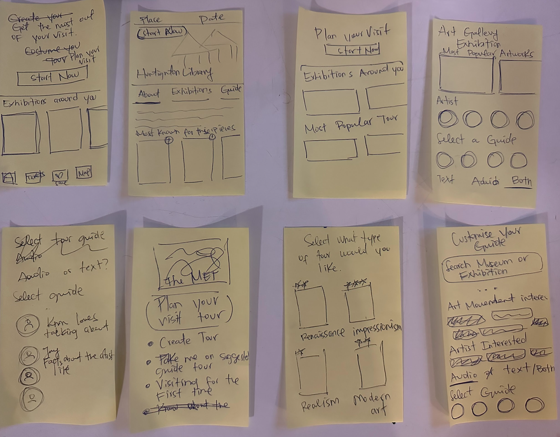
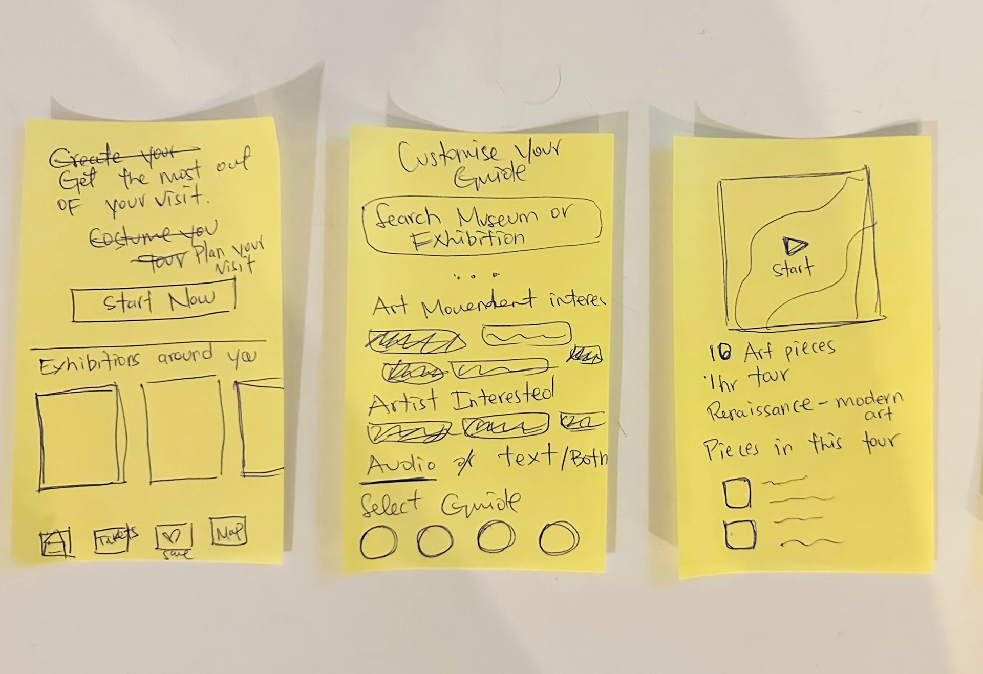
Crazy 8's Exercise
I explore a variety of layouts to structure the design of the most critical screens. I chose the screen that incentivizes the user to create a curated tour. This screen was essential because it contained featured pieces in the museum.
I decided to create the main screen, which tells the user to start his/her experience by creating a museum tour. Allowing the user to jump from different paths. Then my second critical screen displays the "curated tour" to the user. I chose the first solution since this will set the tone for how the user will be guided through the museum.
Day 3 - Define which solution to persuade
I needed to decide which solution I would pursue along with a storyboard that would guide me later on the first screens of my prototype.
I began the storyboard with a user who is already familiar with the museum they are visiting, and they are seeking to gain something out of their visit.
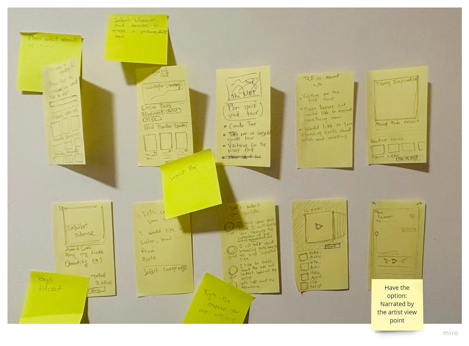
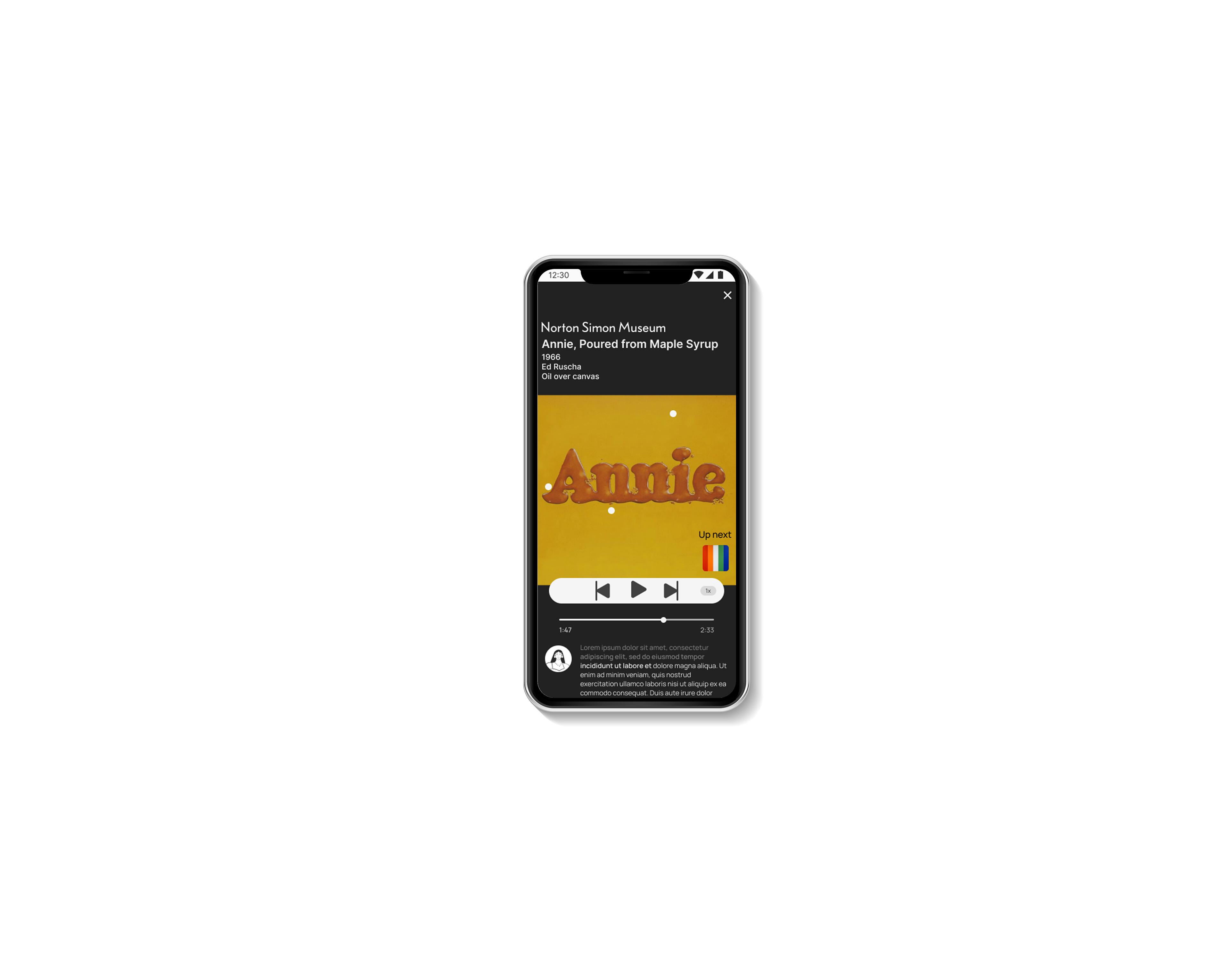
Gallery Pal is a self-guided app that goes at your own learning pace and interest.
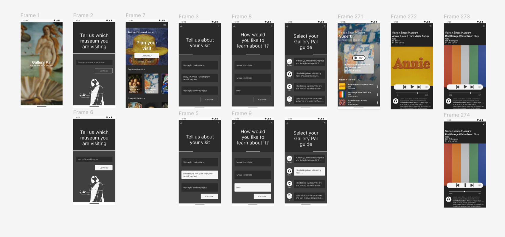
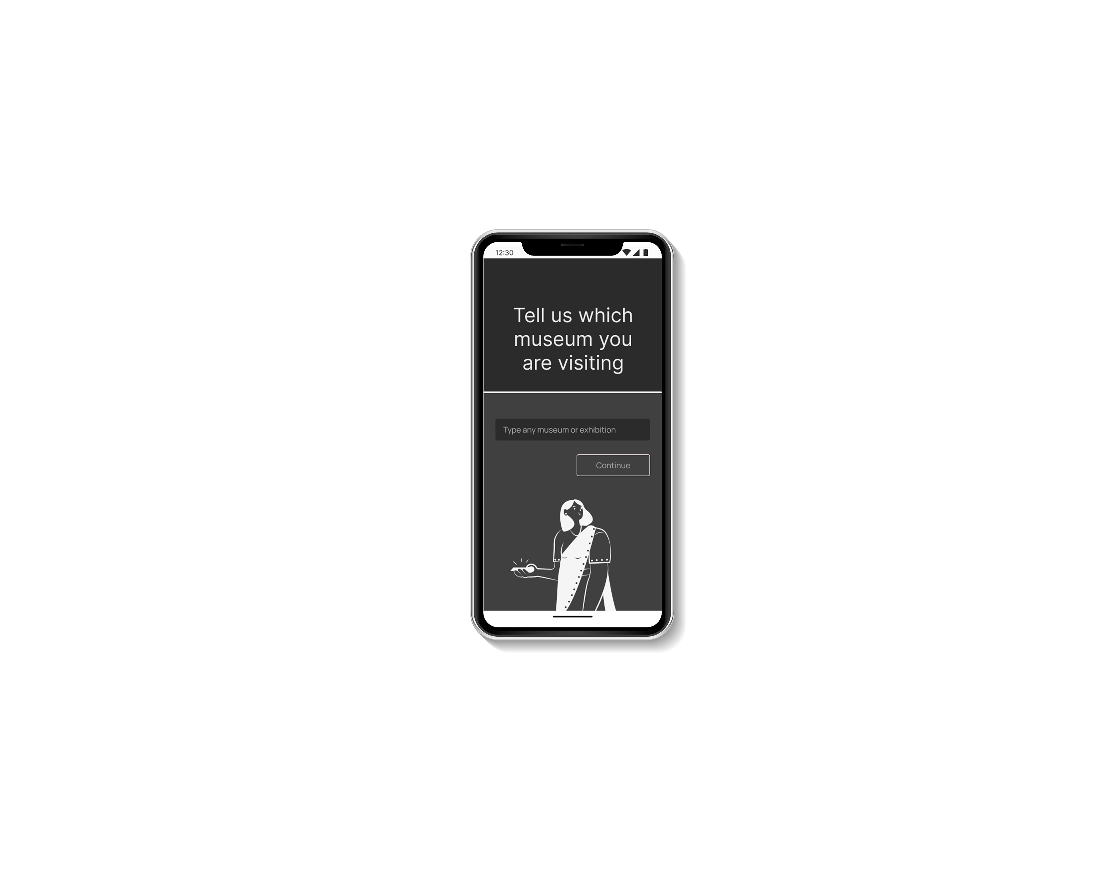
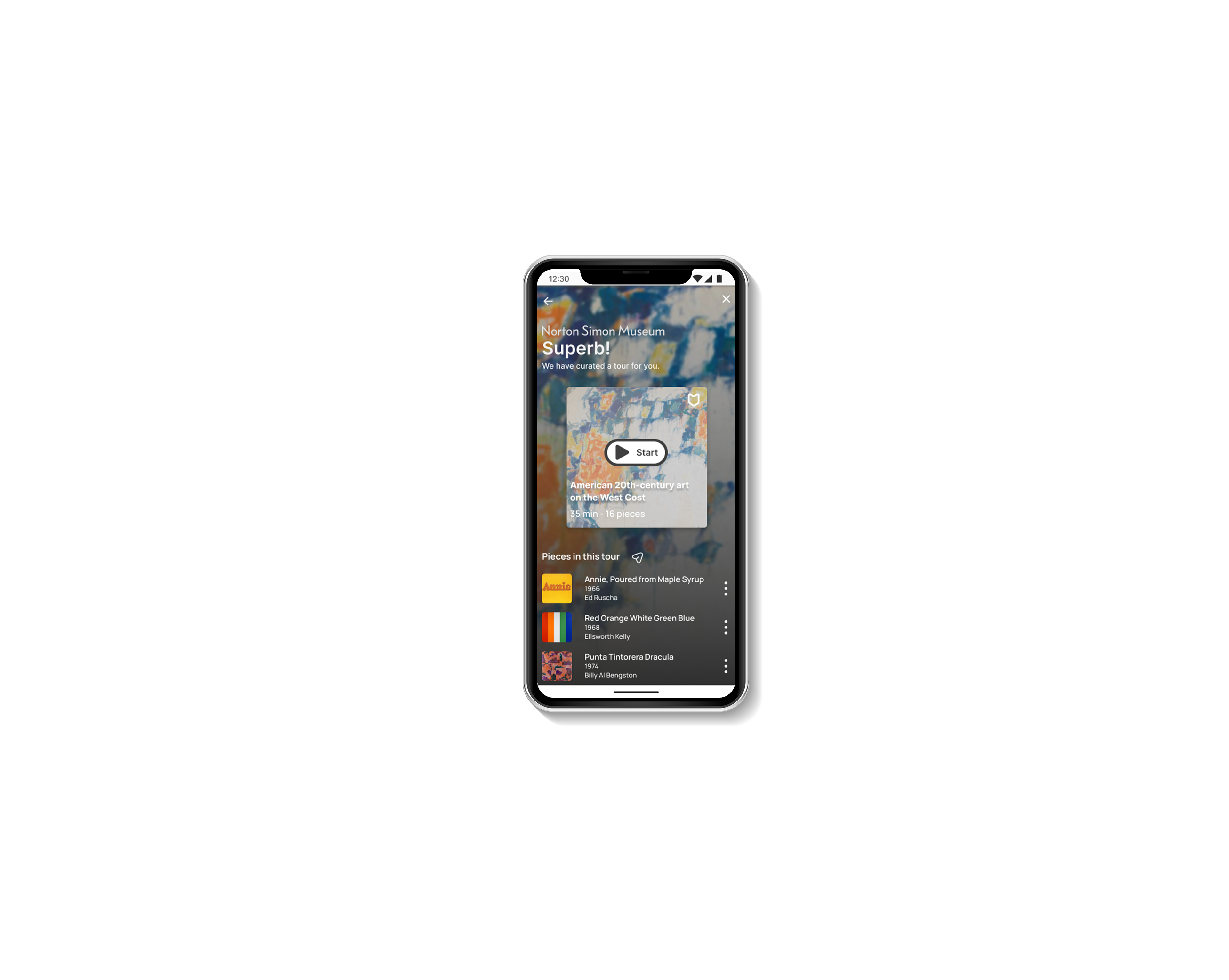
The user enters the app, types the museum he is planning to visit, and then gets to a main screen where it shows all the featured collections, temporary exhibits, and events the museum is having. On the top of the menu, a giant banner will say Plan your Visit: Create your tour. This will guide the user to answer some questions to understand what information the user plans to get from his visit. After that, a screen with a "curated" art playlist will appear.
Day 4 - Storyboard and prototype
With my storyboard 90% completed and my red route in mind. I spent day 4 of my design sprint creating a prototype of the screens for Gallery Pal. I use Figma to bring my screens to life and then upload them on InVision to feel my mock-up. The primary purpose of my prototype is to have a personalized experience when visiting a museum by creating a curated tour that a "Gallery Pal will guide." As I move into user testing, I'd like to know if the app's concept is easy to understand and meets the expectations of a potential user.
These were some of the questions in preparation for testing the prototype:
Can the user easily understand the overall concept of the app?
Are the onboarding questions relevant to the result?
Are the functionality and aesthetic of the app pleasant?
When navigating the main menu (before creating the tour), does the user find the feature information meaningful?
Are the guide profiles helpful?
High fidelity Screens
Day 5 - Usability Test
By conducting my usability test, I observed how the participants interacted with the app Gallery Pal, how easy it was to understand the overall concept, and how I could improve the experience.
The main red route consisted of planning a visit to a museum by creating a tour based on the visitor's interest and the goal of the visit.
All five participants completed the tasks successfully, so I knew the app's primary purpose was working well overall. However, the participants suggested a few additional changes to the app.
Findings
"It is essential to use the same language throughout the app." suggestion: Use the exact keywords throughout the screens.
"When customizing the guide, I think the first screen should consist of selecting the gallery guide according to the user's need." suggestion: after selecting Create Tour in the home screen, have the screen that asks the user which gallery pal guide want to have then on the second screen ask how it would like the tour to be presented: audio, reading, or both.
"When starting the tour, it feels abrupt to go right away into the tour." suggestion: Have an instruction before starting the tour. E.g., welcome to your personalized tour. My name is... I'll be your gallery pal guide. Please proceed to this location.
Next steps
Develop the home page with pre-curated tours
Have maps implemented for navigation at each gallery
Develop more into the idea of liked paintings. Based on style, artists and media make pre-curated tours based on the user's interest.